4 Quick Marketing Data Visualisation Techniques

Data visualisation is key to being effective. Marketers need to harness the data available to them and translate it into insights followed by actions.
For those actions to drive positive outcomes, it is crucial that data is accurate and understood correctly.
In this blog post, Graham Cross shares his top tips on visualising data for marketers.
Why Should I Visualise My Data?
Visualising data is a great way to quickly share and understand the information locked inside a collection of numbers. This allows you to tell data stories, make decisions and spot patterns.
Good visualisations are:
- Quick to read.
- Easily absorbed.
- Accurately understood.
Technique #1: Pick the Right Data Visualisation Tool for the Job
The type of visual to use depends on what kind of information you are looking to share and how that information will be used.
The three most basic visuals are tables, line graphs and bar charts.
Tables
Tables are best as a reference for when you need to look up an exact value from a combination of options.
They don’t work for spotting patterns or telling a story; most people don’t find it easy to trawl through a large set of numbers.

Line Graphs
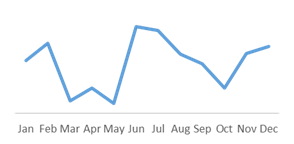
Line graphs are best for looking at trends over a continuous range of values e.g. time (days, months, quarters, etc.).
Top Tip: Always put a time sequence from left to right, never up/down on line graphs.
Bar Charts
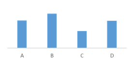
Bar charts are great for comparing discrete categories of information such as marketing performance across PPC campaigns or the platforms used for paid social advertising.
Technique #2: Put it in Perspective
When visualising marketing data (or any other data), be careful with the scales (min/max measured values) on your charts as this has a direct impact on the reader’s perspective.
Our brains like to assign value based on the size of objects and then proceed to make comparisons.
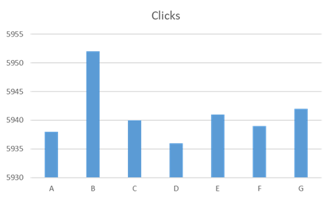
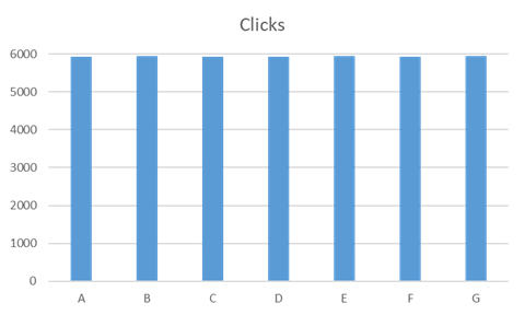
In the chart above, campaign B looks like an exceptional performer at first glance, providing double the clicks of any other campaign.
But in this example, our scale starts at 5930 and B has only provided 12 more clicks than C (+0.2%). Even knowing the scale range it is hard to comprehend variations appropriately.
Below, you can see the clicks on an appropriate scale.
Our brains work differently for line graphs because there is no length to the data points.
Line charts are used for viewing trends (e.g. over time), so it can be fine to skip the unused low end of the scale to better see the movements.
However, when doing this consider highlighting that the chart doesn’t start at zero to aid your readers understand the magnitude of the variations.
Top Tip: Always start the Y axis of a bar chart at zero.
Technique #3: 2D or Not 2D, There is No Question
As soon as you try to put a chart in to 3D, accurately reading the values becomes more of a challenge. Particularly the further away from the axis you get.
In the graph below, it is a lot harder to quickly see the values of columns C and D.
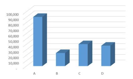
The same data is presented in 2D in the chart below. In this instance it is very easy to quickly tell that column C is 40,000.
In the chart above, not only do you have to follow the grid line round, but the back of the column also appears higher than the front thanks to the 3D effect.
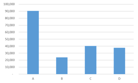
Top Tip: Always stick to 2D.
Technique #4: Stop Using Pie Charts
I’ll admit this last one is a bit self-indulgent but I hate pie charts! They may look nice but they fail our goal of being accurately understood.
Plus I’m colour blind and it can be really hard to decipher which segment is which.
Take the below example of revenues earned across various advertising platforms:
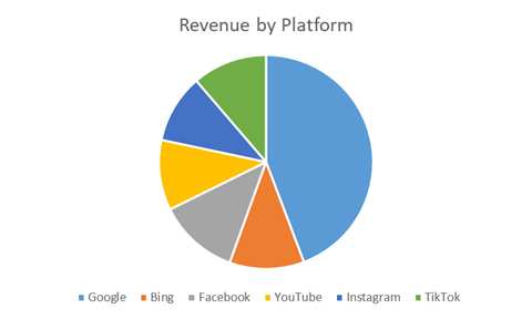
Google provides the lion’s share of revenue, but which platform is next?
Even if you get the answer correct you’ve probably spent extra time peering closely at the screen and couldn’t confidently put all platforms in order.
The whole point of a chart is to allow us to quickly assimilate information but the human brain hasn’t evolved to accurately compare circles and arcs. This also applies to donut and radar charts.
Top Tip: When comparison is required, use a bar chart.
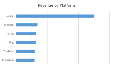
Consider ordering the categories by value (£ or % share) to make it easier to read and earn bonus points from your colour blind readers.
The Exception
If you are communicating a data story to make or shape decisions, then accuracy and understanding is always paramount. However, there are times when marketers need charts to stand out and grab attention. When this is the case, prioritising visual impact may well be a valid approach.
Are you visualising accurate data? We’ve found that 80% of core analytics data is wrong, leading to poor decisions and wasted budgets. Use our ROI calculator below to find out how you can improve your performance with accurate attribution.
Struggling to Identify Wasted Spend?
Find out where to move budget to improve marketing efficiency with our ROI Calculator.
Own your marketing data & simplify your tech stack.
Have you read?
I have worked in SEO for 12+ years and I’ve seen the landscape shift a dozen times over. But the rollout of generative search engines (GSEs) feels like the biggest...
As you will have likely seen, last week Google released the March 2024 Core Algorithm Update. With it, comes a host of changes aiming to improve the quality of ranking...
After a year of seemingly constant Google core updates and the increasingly widespread usage of AI, the SEO landscape is changing more quickly than ever. With this rapid pace of...


